Modura
The most comprehensive project encompassing branding, product design, prototyping, etc. from start to finish. The client was completely starting from scratch with only a name for their clothing brand and a target demographic. Two options for logos were requested, a color palette, a set of icon designs, font choice, and 3 screens for app design for an investor pitch deck were the main highlights of this project.
Branding
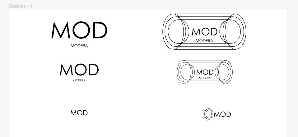
The logos concepts I created needed to be minimalistic yet professional looking while still appealing to the target demographic. I chose to mirror the concept of the clothing brand Forever 21 when picking a logo, where Forever 21 can be seen written out in long form or also recognizable by XXI - thus shortening Modura to just Mod with the full brand name underneath was conceptualized.
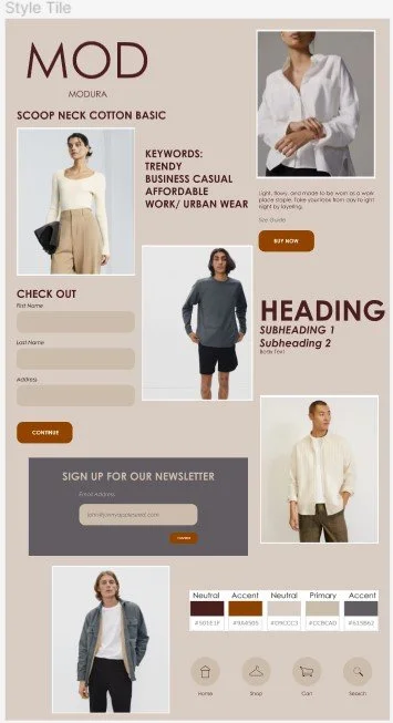
For the color palette, I wanted to bring the feel of the city meets neutral office-appropriate earth tones. In the style tile to the right, I chose a single font, with different weights to create text hierarchy. The icons created also maintained clean rounded lines and simplicity.
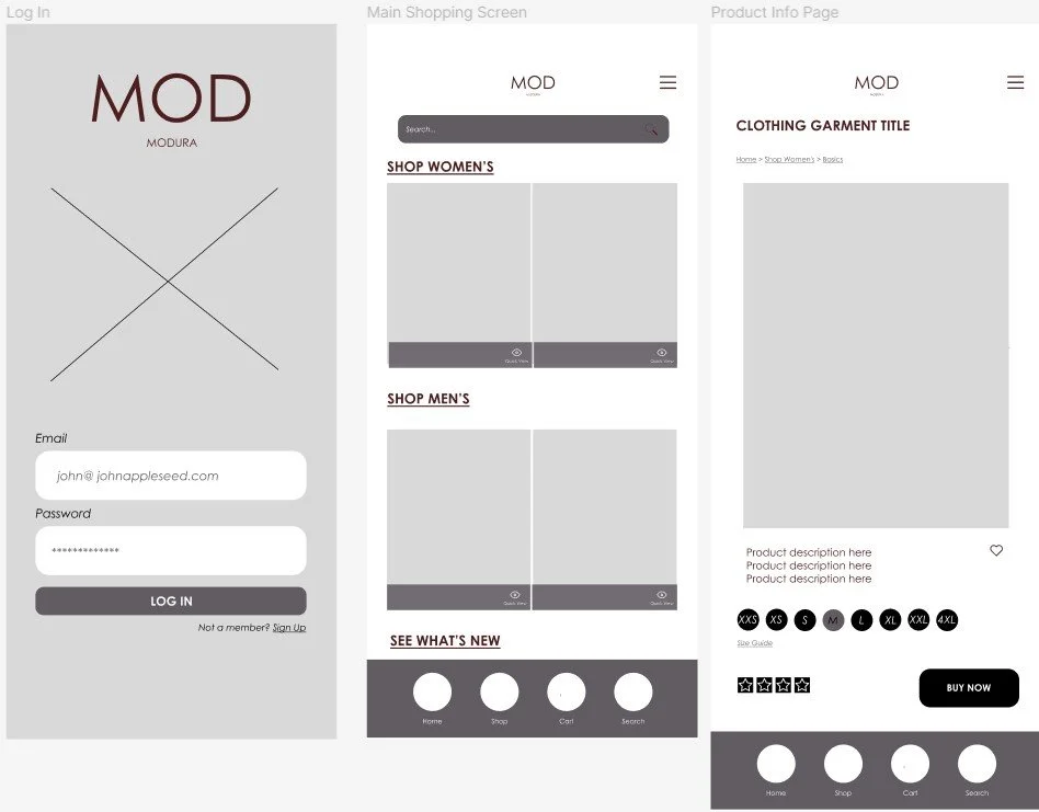
App Design
For the login page, I kept this nice and clean, choosing imagery that represented the blending of city meets office lifestyle. The home page features quick search navigation and categories for a seamless user journey. The navigation buttons chosen also give the user access to the shop home page, their cart, and search no matter what page they're on. The product page features lots of whitespace and room for everything to settle and not be overcrowded - with features highlighting a favorite button and easy access to read reviews.